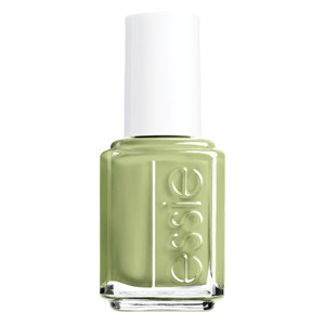
I have been mooning over the China Glaze Electropop collection for the past two weeks and stalking my local Ulta for its release. I haven't seen it in person yet but during my obsessive stalking, I stumlbed over the newest collection from Essie. It may not be the new China Glaze collection but I need something to look out to hold me over until the full release. Essie's new collection came out right in time to distract me and feed my craving for new spring nail polish shades. This collection consists of six new shades, typical for an Essie collection. Three of the new shades are pastels, two are definitely brights, and the last one is a bit more muted than any of the others.
"Follow my navigate-her to new worlds of color.", states the company founder of Essie when describing the theme of this series of polish shades. It appears like this company was inspired by a nautical theme when coming up with this collection, however it is not your typical reds and blues in this collection. We have a series of pink hues here, with one bright coral and a pastel mint green shade to round it out. I think that the shades are very pretty, I just don't quite understand how the nautical theme came out of this group of polishes...
We will start with the pastel polishes since they are what I have been chasing down from China Glaze. A Crewed Interest is a "luminous peach shade" with a cream finish. This one is a true pale peach, it is on the warmer side. It is pretty but not very unique, how many other companies have a shade that looks exactly like this in their polish line-up?! This shade is a good basic and would work well in the professional environment but I don't think that it is going to inspire lust from many people. the second of the pastel shades is Navigate Her, a "light, bright green". This shade is a mint cream and might be my favorite of the collection, it reminds me of the old MAC shade Peppermint Patty (Spring 2009 - Sugar Sweet collection) that was sold out before I was ever able to get to the counter. I love this shade and I can see this one being very popular this spring, I must pick this up the next time that I head over to Ulta. The last of the pastel range in this collection is To Buy Or Not To Buy. It is my second favorite shade of the collection, a "lavender with shimmer". I love this type of shade in the spring months, it's the perfect cool pale lilac hue and will fit in very well with the rest of the nail polish trends.
Next we will go onto the bright hues in this collection. I don't really like either of these shades, they are one the warmer side and we all know that isn't the best coloring for my skintone. I don't see myself wanting to buy either of these at the moment. Orange, It's Obvious is a "bright orange" and one of the ugliest shades that I have seen this season. It is a true bright orange, think the shade of buoys in the ocean. Not my cup of tea and I think this would be better as a summer shade instead of a spring shade. The second of the bright polishes is Ole Caliente. This is a "red-orange with a pink undertone" and is another one that would have been much better in the summer. This one is more attractive than the orange shade but the only way that I would consider wearing it is for a beach pedicure. Maybe. Both of these shades are cream finishes, which is really good since these bright hues plus a shimmer finish would have bordered on tacky. I will not be finding any brights for myself from this collection.
The last shade in this collection was the hardest shade to place. It has potential to be a bright but lacks the "pow" that the coral and orange shades have. That isn't to say that it is bad shade but it seems somewhat out of place with the rest of the shades in this collection. Tour de Finance is the oddest name that I have seen recently for a nail polish. Do they mean finance as in Wall Street and the Stock Market? If so, what does that have to do with this nail polish collection and how would that name have anything to do with this nail polish shade? I admit that I am baffled as to this name. The shade itself is a "fushcia with shimmer", it is another one of the pretty not but not unique shades in this collection. This collection would have been complete without it and I can't see this one being a cult favorite either.
I love two of the pastel shades in this collection, however the rest of the collection doesn't do anything for me. The brights are way too warm and loud for me to pull off. The other two shades are so generic and boring that they are instantly forgettable. This is an ok collection but I just don't really see where these shades came from and how they tie into a nautical theme...
photo courtesy of Essie

No comments:
Post a Comment