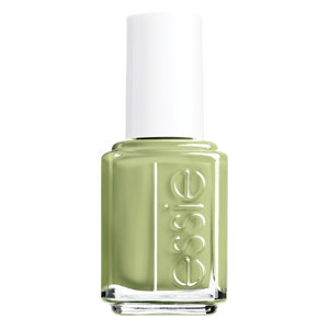
We just looked at the Deborah Lippmann spring nail polish collection the other day and now we are looking at what I believe is the first of two Essie polish collections. I first saw this collection in an ad contained in Allure and I have finally found it up on their website. The reason that I believe that this the first of two collections is that the company's founder describes this as more of a "late winter" collection than a true "spring" collection. I am sure that the second collection will contain the traditional pastel shades that we saw in the last spring polish collection and I am happy that this company has decided to release two collections so that they can cater to all tastes...not everyone loves pastels.
The company's founder (Essie Weingarten" describes this collection with a quote. "A beach escape is just the thing to recharge, renew, and break free of winter's icy reach.", states the Essie website. There are four shades contained in this little collection, one deep shade and three lighter shades. I am not looking for any new shades of dark polishes so I am more interested in the paler neutrals contained in the collection and then I will save my shopping of pastels for the next release from this company.
The four shades contained in the Essie Resort collection are...
- Resort Fling - bright peach cream
- Find Me An Oasis - very pale blue cream
- Cocktails and Coconuts - neutral tan cream with gold shimmer
- Under The Twilight - very dark purple cream
Under The Twilight is such a dark shade of purple that I actually thought that it was a black cream until I saw the shade description. I might have been interested in this shade last fall but I am certainly not in the market for this dark of a shade right now, I will be skipping over this shade. Resort Fling is a bright peach and this is not a color that I tend to prefer, I will also be skipping over this shade. I initially thought that Find Me An Oasis was a pale silver cream but it is actually a very pale blue. It appears almost white in pictures that I found on Google and I don't like this shade either. The only shade that I really like is Cocktails and Coconuts, this neutral cream contained a gold shimmer and has the potential to be another one of favorite neutral shades. I will definitely be picking up a bottle of this shade but will skip over all the others.
The Essie formula is not one of my favorites and I tend to only buy bottles of these polishes when I really like the shades. I have found that this formula tends to be very hit or miss, I have had shades that are great and then I have had shades that take three or more coats to fully build up. The neutrals and the jewel-toned shades are usually the best and the pastels typically are the hardest to work with. I will be checking out a bunch of other spring polish collections before I decide if there are any other shades from those collections that I will want more than those in this formula...
photo courtesy of Google
Showing posts with label Essie. Show all posts
Wednesday, January 15, 2014
Tuesday, November 19, 2013
Essie Holiday 2013 Collection - Encrusted Treasures
I have been reading reviews of the new holiday collection from Essie and I think that I will tackling the Encrusted Treasures collection today. This collection contains six new polish shades and is the first time that Essie is trying the "textured" polishes that OPI has made popular in the past few months. I am not a fan of OPI's Liquid Sand polishes and I have heard that the Essie shades make these look nice...
The prettiest holiday color collections gain media and blog coverage for beautiful shades and unique products, this collection is gaining coverage for being one of the ugliest collections of the season. I was reading about Encrusted Treasured on The PolishAholic's beauty blog and I was intrigued by her reviews of what she considers to be a group of truly hideous shades. It is rare that I am attracted to ugly shades but I couldn't look away from the swatches of these over-the-top colors. This collection contains six new shades for the holiday season, four of which are glitter finishes and two of which are this company's version of the textured finishes. There is a chance that I might be attracted to one of the glitter finishes but we will see what my thoughts are when I look at the whole collection.
We are starting with the four glitter shades and then finishing with the two textured shades.
- Ignite The Night - silver and gray glitter
- Lots Of Lux - bright blue glitter with hints of gold
- On A Silver Platter - bright blue hexagonal glitter suspended in a gold base
- Peak Of Chic - large white bar glitter suspended in a clear base
The textured shades...
- Hor D'oeuvres - silver and gold glitter with large silver pieces in a clear base
- Belugaria - big black pieces of glitter in a black cream base
This collection has a few pretty shades in but it is definitely not my cup of tea. Ignite The Night is my favorite of the collection, I would wear this silver and gray glitter more often this winter than any of the other shades. Lots Of Lux is very pretty and quite unique, I don't own any blue bright glitters in my collection and I think this shade will fill the hole very well. Peak Of Chic is a good neutral glitter shade and I like that I would be able to wear this shade all throughout the year.
The rest of this collection are not shades that I would wear. On A Silver Platter is an ugly combination of hues, I have never seen anything like this shade and I doubt that I will ever see anything like it again. Both of the textured shades have too many going on in the bottle for me to ever want to wear them.
I can see the Belugaria shade being a cult favorite, this is a one of a kind shade that only comes around once in a few years. I like that Essie has broken with the "traditional" holiday shades for this collection but I can't say that I really love this collection. This is probably one of my least favorite collections of the season however it is certainly one of the most unique.
courtesy of Essie
The prettiest holiday color collections gain media and blog coverage for beautiful shades and unique products, this collection is gaining coverage for being one of the ugliest collections of the season. I was reading about Encrusted Treasured on The PolishAholic's beauty blog and I was intrigued by her reviews of what she considers to be a group of truly hideous shades. It is rare that I am attracted to ugly shades but I couldn't look away from the swatches of these over-the-top colors. This collection contains six new shades for the holiday season, four of which are glitter finishes and two of which are this company's version of the textured finishes. There is a chance that I might be attracted to one of the glitter finishes but we will see what my thoughts are when I look at the whole collection.
We are starting with the four glitter shades and then finishing with the two textured shades.
- Ignite The Night - silver and gray glitter
- Lots Of Lux - bright blue glitter with hints of gold
- On A Silver Platter - bright blue hexagonal glitter suspended in a gold base
- Peak Of Chic - large white bar glitter suspended in a clear base
The textured shades...
- Hor D'oeuvres - silver and gold glitter with large silver pieces in a clear base
- Belugaria - big black pieces of glitter in a black cream base
This collection has a few pretty shades in but it is definitely not my cup of tea. Ignite The Night is my favorite of the collection, I would wear this silver and gray glitter more often this winter than any of the other shades. Lots Of Lux is very pretty and quite unique, I don't own any blue bright glitters in my collection and I think this shade will fill the hole very well. Peak Of Chic is a good neutral glitter shade and I like that I would be able to wear this shade all throughout the year.
The rest of this collection are not shades that I would wear. On A Silver Platter is an ugly combination of hues, I have never seen anything like this shade and I doubt that I will ever see anything like it again. Both of the textured shades have too many going on in the bottle for me to ever want to wear them.
I can see the Belugaria shade being a cult favorite, this is a one of a kind shade that only comes around once in a few years. I like that Essie has broken with the "traditional" holiday shades for this collection but I can't say that I really love this collection. This is probably one of my least favorite collections of the season however it is certainly one of the most unique.
courtesy of Essie
Wednesday, August 7, 2013
Essie Fall 2013 Nail Polish Collection
My nail polish obsession has only continued to grow since I started doing yoga and decided that I needed weekly pedicures in order to survive the bare foot sessions. Bad pedicures are considered a sin in yoga classes and I am determined to stay above the curve on this issue...not that I think that I will have much of a problem with this. Now I will be thinking about more about fall polish shades for my weekly pedicures and feel that I need to add some new jewel tones to my collection. I also think that I would like a good neutral in my collection so that I always have a neutral in my collection. Essie has just released their new fall collection this week and now I have some more selections to add my collection...
There are six new shades in this collection, nearly all of which are deep jewel tones. There are four deep hues in this collection and two lighter shades offered along with them. On first glance, I am more interested in the deeper shades and find the lighter shades to be boring side. There is a deep navy blue in the new shade offerings and I always want to add more deep blues to my collection so I already see one that I will really want when I get to Ulta.
We will start with the two lighter shades in this collection since they could both be bought and worn right now. Vested Interest is the lightest of the shades and is a "dusty green" with a cream finish. It appears gray in pictures and would be a nice neutral for fall but isn't unique enough to warrant me purchasing a bottle of the polish. The second of the lighter hues is called The Lace is On. This is a deep pink with what appears to be a purple shimmer to it. I am not a fan of this shade and it appears more magenta than pink to me. I can easily skip over both of these shades without my nail polish collection suffering and I am moving onto the deeper hues in the collection now.
The first shade that I want to look at is the dark blue shade and this is the one that is featured in the print ads for this collection. After School Boy Blazer is a "deep navy cream" and one that I know I will love to add to my collection. It is a nice navy cream that I will use in manicures and pedicures this fall and winter and will be the first shade from this collection that I will want to buy. The next shade is another one that I must have, Cashmere Bathrobe is a great neutral and one that I could use with all kinds of colors. This shade is a "deep gray" and has a slight silver shimmer to it. I don't see much of a shimmer in the picture and I have a feeling that this will only come out in the outdoors. I wanted a great neutral to use all throughout the seasons and this is one that I will be adding to my collection. Cashmere Bathrobe might even edge out After School Blazer as the one shade that I must buy from this collection.
The next shade is a traditional red cream that is part of nearly every single fall collection. Twin Sweater Set is such a cute name that I might need the polish just for the name but I do like the shade too. I have similar red creams but I use them all the time on my toes and this one is worth a purchase. The last shade in the collection is named For The Twill of It and this one is very unique. This one is a shimmering deep gray and one that I thought that I would love. However, I looked it up on blogs and it is a duochrome that shines purple or blue. I'm not a big fan of the duochome and liked the shade better when I thought it was a deep gray shimmer. I will be skipping over that shade now.
After School Blazer is my favorite shade of the new collection but I think that Cashmere Bathrobe is the shade that I would buy first. I have nothing like this one in my collection and would use this one all throughout the next two seasons. I want to round my shopping out with Twin Sweater Set and grab a new red for yoga pedicures.
photo courtesy of Essie
There are six new shades in this collection, nearly all of which are deep jewel tones. There are four deep hues in this collection and two lighter shades offered along with them. On first glance, I am more interested in the deeper shades and find the lighter shades to be boring side. There is a deep navy blue in the new shade offerings and I always want to add more deep blues to my collection so I already see one that I will really want when I get to Ulta.
We will start with the two lighter shades in this collection since they could both be bought and worn right now. Vested Interest is the lightest of the shades and is a "dusty green" with a cream finish. It appears gray in pictures and would be a nice neutral for fall but isn't unique enough to warrant me purchasing a bottle of the polish. The second of the lighter hues is called The Lace is On. This is a deep pink with what appears to be a purple shimmer to it. I am not a fan of this shade and it appears more magenta than pink to me. I can easily skip over both of these shades without my nail polish collection suffering and I am moving onto the deeper hues in the collection now.
The first shade that I want to look at is the dark blue shade and this is the one that is featured in the print ads for this collection. After School Boy Blazer is a "deep navy cream" and one that I know I will love to add to my collection. It is a nice navy cream that I will use in manicures and pedicures this fall and winter and will be the first shade from this collection that I will want to buy. The next shade is another one that I must have, Cashmere Bathrobe is a great neutral and one that I could use with all kinds of colors. This shade is a "deep gray" and has a slight silver shimmer to it. I don't see much of a shimmer in the picture and I have a feeling that this will only come out in the outdoors. I wanted a great neutral to use all throughout the seasons and this is one that I will be adding to my collection. Cashmere Bathrobe might even edge out After School Blazer as the one shade that I must buy from this collection.
The next shade is a traditional red cream that is part of nearly every single fall collection. Twin Sweater Set is such a cute name that I might need the polish just for the name but I do like the shade too. I have similar red creams but I use them all the time on my toes and this one is worth a purchase. The last shade in the collection is named For The Twill of It and this one is very unique. This one is a shimmering deep gray and one that I thought that I would love. However, I looked it up on blogs and it is a duochrome that shines purple or blue. I'm not a big fan of the duochome and liked the shade better when I thought it was a deep gray shimmer. I will be skipping over that shade now.
After School Blazer is my favorite shade of the new collection but I think that Cashmere Bathrobe is the shade that I would buy first. I have nothing like this one in my collection and would use this one all throughout the next two seasons. I want to round my shopping out with Twin Sweater Set and grab a new red for yoga pedicures.
photo courtesy of Essie
Friday, May 10, 2013
Essie Summer 2013 Collection - Naughty Nautical
I have been slowly switching over all of my nail polishes to summer brights and I am excited to buy even more shades of polish before my big birthday celebration in two weeks. I have looked at a bunch of collections so far and since the newest from China Glaze has not come out yet, I have decided to check out the latest collection from Essie. Essie is not my favorite nail polish formula but I still like to check out the colors every season, this a good line for colors that I will only wear for a day or night. I have not had the best track record with this formula for staying on and not chipping for more than two or three days so I am more likely to find the most unique colors in this line that I would only wear to match one or two items in my closet. I think that I want another bright aqua shade for summer and this is a collection that I could easily find one in.
The next collection from Essie is named Naughty Nautical and contains six new shades, three of which are more pale and the rest of which are brights. Two of the pales are more unique and each of the brights are pretty unique so I see that this collection has some potential for me. I have a favorite Lilly Pulitzer dress that I am always on the lookout for shades to match perfectly and I spy some great hues in this line up.
The first quote about this collection is from the founder of the Essie line of polishes. "Sound the bell, I've been Naughty Nautical." More information is included with the full collection description, "Want to make fashion waves? Embark on a chic color adventure in maritime pastels - delicately sparkling lights and ultra soft brights that whisper easy elegance. Cruise into summer with the nail collection that's totally ship shape."
Here are the new shades in the Naughty Nautical collection!
Full Steam Ahead - Take the helm and embark on a fantastic voyage. This medium toned lilac nail polish with a pearlescent punch steers you in style.
Rock the Boat - Now's your chance to make some stylish waves. This simmering nail polish in french blue makes a splash every time.
The More the Merrier - An oceanside bungalow is the perfect spot for a party and this juicy lime green nail polish. Luxe loves company!
Naughty Nautical - Sail the sexy seas and chart a course for adventure in this shimmering brilliant blue-green nail polish. Naughty never looked so nice.
The Girls are Out - You've got nothing to hide with this soft fuchsia peony nail polish infused with subtle sparkle.
Sunday Funday - Turn everyday into a ridiculously good time with this beautiful, tangerine crush coral nail polish with soft shimmer.
Naughty Nautical is my early favorite of the collection, it reminds me very much of Butter London's Slapper (which I currently lover and have no idea how I lived without it before ordering it from Sephora's Friends and Family Sale) with a hint of shimmer. This will be a great pedicure shade for the summer months and I am so looking forward to finding this shade at Ulta. This is the only shade that I must own from this collection however I would be more than happy to own a bunch of the other shades. This might be the best chance for me to buy a green nail polish shade this summer, The More the Merrier is a pretty green and I would try to match it up with a favorite sundress of mine. I would also like the The Girls are Out, I have shades that I similar to this however they are either cream or almost a full out glitter finish and this one would be a happy medium. Another great pedicure shade and depending on how deep this color is, I could use it into the early stages of fall. Rock the Boat is the last shade that I want from this collection, I love pale blues as much as I love bright blues and the shimmer on this one makes it unique.
This is good collection for some fun shades for summer, I don't really turn to this line of polishes for core shades as the formula doesn't last long enough on me to use on a regular basis (especially if I don't have time to change my polish every other day), I can't wait for more blue hues for the summer and I found one that I must have in this collection!
photo courtesy of Essie's Facebook page
The next collection from Essie is named Naughty Nautical and contains six new shades, three of which are more pale and the rest of which are brights. Two of the pales are more unique and each of the brights are pretty unique so I see that this collection has some potential for me. I have a favorite Lilly Pulitzer dress that I am always on the lookout for shades to match perfectly and I spy some great hues in this line up.
The first quote about this collection is from the founder of the Essie line of polishes. "Sound the bell, I've been Naughty Nautical." More information is included with the full collection description, "Want to make fashion waves? Embark on a chic color adventure in maritime pastels - delicately sparkling lights and ultra soft brights that whisper easy elegance. Cruise into summer with the nail collection that's totally ship shape."
Here are the new shades in the Naughty Nautical collection!
Full Steam Ahead - Take the helm and embark on a fantastic voyage. This medium toned lilac nail polish with a pearlescent punch steers you in style.
Rock the Boat - Now's your chance to make some stylish waves. This simmering nail polish in french blue makes a splash every time.
The More the Merrier - An oceanside bungalow is the perfect spot for a party and this juicy lime green nail polish. Luxe loves company!
Naughty Nautical - Sail the sexy seas and chart a course for adventure in this shimmering brilliant blue-green nail polish. Naughty never looked so nice.
The Girls are Out - You've got nothing to hide with this soft fuchsia peony nail polish infused with subtle sparkle.
Sunday Funday - Turn everyday into a ridiculously good time with this beautiful, tangerine crush coral nail polish with soft shimmer.
Naughty Nautical is my early favorite of the collection, it reminds me very much of Butter London's Slapper (which I currently lover and have no idea how I lived without it before ordering it from Sephora's Friends and Family Sale) with a hint of shimmer. This will be a great pedicure shade for the summer months and I am so looking forward to finding this shade at Ulta. This is the only shade that I must own from this collection however I would be more than happy to own a bunch of the other shades. This might be the best chance for me to buy a green nail polish shade this summer, The More the Merrier is a pretty green and I would try to match it up with a favorite sundress of mine. I would also like the The Girls are Out, I have shades that I similar to this however they are either cream or almost a full out glitter finish and this one would be a happy medium. Another great pedicure shade and depending on how deep this color is, I could use it into the early stages of fall. Rock the Boat is the last shade that I want from this collection, I love pale blues as much as I love bright blues and the shimmer on this one makes it unique.
This is good collection for some fun shades for summer, I don't really turn to this line of polishes for core shades as the formula doesn't last long enough on me to use on a regular basis (especially if I don't have time to change my polish every other day), I can't wait for more blue hues for the summer and I found one that I must have in this collection!
photo courtesy of Essie's Facebook page
Saturday, February 23, 2013
Essie Spring 2013 Collection - Madison Ave-Hue
We are on a roll with the spring collections and today we are going to check yet another one out. Today we are going to look at a nail polish spring collection instead of a full color collection, I have been loving almost every single nail polish hue that I have seen this spring and I am so excited to check out the latest collection from Essie. I am still stuck on both the new collection from Butter London and the new polishes from the Illamasqua spring collection, I cannot wait to order one of the speckled polishes and see how it looks when applied to the nail. The Essie polish collection looks like is going to be a more traditional type of spring collection than either of those, this is certainly not a bad thing. I am always looking for some new pinks and pretty pastels every single spring season and this collection has the promise to provide some great choices!
This collection from Essie consists of six new polish shades, all of which will be perfect for the upcoming warm weather. The collection is named Madison Ave-Hue and all of the polishes are named after famous city streets throughout the world. "Nothing inspires like Madison Ave-Hue.", is the collection description from Essie (the founder of the company). Madison Avenue is one of my favorite streets in New York City and I wanted this polish from the minute that I saw the name on this polish. It certainly helps that it is bright pink shade that I really love. I have a feeling that I will be bringing some new polishes home with me the next time that I visit Ulta...
The first shade in this collection is the shade that inspired the whole name of the collection, Madison Ave-Hue. This shade is a "Chic upper east side pink steps out in style, turning any ensemble into a million dollar baby. Cha-ching." This shade is the shade that is pictured, it is cool medium pink and it appears to have a hint of shimmer in it, I really want to buy this shade and I know that I will wear it all spring and summer. Hip-anema is the only other bright shade in this collection, most of them are pastels and only two are brights. This shade is a "Sashay down a sandy runway in poppy-bright red orange and show 'em who's bossa. Work that beach.". This bright orange red is not the shade for me. The website makes it appear more orange than a true red and I know this shade would be too warm for me to pull off. I will be skipping over the red from this collection but that pink hue has my name all over it!
Now we are going to go onto the area of the collection with the more traditional pastels for spring. There are four hues in this part of the collection, the blue shade is slightly brighter but not bright enough for me to put it in the other part of this collection. I can envision myself getting a good amount of use from all of these shades, I tend to wear pales most of the spring and am always looking for new shades. Bond With Whomever is the first of the shades. "London's calling. Pick it up in the posh lilac and click with the cultured clique - here, there, and everywhere." I have been all over pale lilac shades this season and I would like to add this one to my collection. Last year, I bought a pale lilac shimmer polish from this company so I do want to see this shade in real life before I purchase it, in case it is almost the exact same shade. The second of the paler shades is the semi-bright blue. Avenue Maintain is described as "Fashionably adroit, lovely Parisian blue channels the Je ne said quoi allure of the captial of chic.", this blue is more of a sky blue and it reminds me of a slightly more blue version of For Audrey. I really like this shade also, this is a great spring blue for me to break away from the navy shades for the season. I think that I will need to add that shade to my collection. the next pale shade is Maximillian Strasse-her, "Bavarian style savvy rules this regal boulevard. In cool gray green, you're promenade queen, no tiara required.". This pale greenish gray is interesting but I am not totally sure that I love it. This is another that I want to see in real life, this has the potenital to be really pretty but also has the potential to be very unflattering on my hands. Pale greens can go either way on my skin so I will decide on this one once I can hold the bottle up to my hand. The last of the of shades in this collection is Go Ginza, a soft petal pink hue. "Soft cherry blossom pink invites you into a floating world of quiet luxury and exquisite beauty. Doma arigato." This shade would be a staple of my nail polish line up, I go through shades like this shade like crazy all throughout the year.
The shades that I want the most from this collection are Madison Ave-hue and Go Ginza, I love these pinks and I will wear both of them all the time throughout the spring. I can't wait to add more pinks to my collection and rock them all spring. The other shade that I really love from the collection is Avenue Maintain, the bright blue. This shade will be super fun for pedicures and manicures all spring and then well into summer.
I love these shades of polishes and I cannot wait to head over to Ulta!
photo courtesy of Essie
This collection from Essie consists of six new polish shades, all of which will be perfect for the upcoming warm weather. The collection is named Madison Ave-Hue and all of the polishes are named after famous city streets throughout the world. "Nothing inspires like Madison Ave-Hue.", is the collection description from Essie (the founder of the company). Madison Avenue is one of my favorite streets in New York City and I wanted this polish from the minute that I saw the name on this polish. It certainly helps that it is bright pink shade that I really love. I have a feeling that I will be bringing some new polishes home with me the next time that I visit Ulta...
The first shade in this collection is the shade that inspired the whole name of the collection, Madison Ave-Hue. This shade is a "Chic upper east side pink steps out in style, turning any ensemble into a million dollar baby. Cha-ching." This shade is the shade that is pictured, it is cool medium pink and it appears to have a hint of shimmer in it, I really want to buy this shade and I know that I will wear it all spring and summer. Hip-anema is the only other bright shade in this collection, most of them are pastels and only two are brights. This shade is a "Sashay down a sandy runway in poppy-bright red orange and show 'em who's bossa. Work that beach.". This bright orange red is not the shade for me. The website makes it appear more orange than a true red and I know this shade would be too warm for me to pull off. I will be skipping over the red from this collection but that pink hue has my name all over it!
Now we are going to go onto the area of the collection with the more traditional pastels for spring. There are four hues in this part of the collection, the blue shade is slightly brighter but not bright enough for me to put it in the other part of this collection. I can envision myself getting a good amount of use from all of these shades, I tend to wear pales most of the spring and am always looking for new shades. Bond With Whomever is the first of the shades. "London's calling. Pick it up in the posh lilac and click with the cultured clique - here, there, and everywhere." I have been all over pale lilac shades this season and I would like to add this one to my collection. Last year, I bought a pale lilac shimmer polish from this company so I do want to see this shade in real life before I purchase it, in case it is almost the exact same shade. The second of the paler shades is the semi-bright blue. Avenue Maintain is described as "Fashionably adroit, lovely Parisian blue channels the Je ne said quoi allure of the captial of chic.", this blue is more of a sky blue and it reminds me of a slightly more blue version of For Audrey. I really like this shade also, this is a great spring blue for me to break away from the navy shades for the season. I think that I will need to add that shade to my collection. the next pale shade is Maximillian Strasse-her, "Bavarian style savvy rules this regal boulevard. In cool gray green, you're promenade queen, no tiara required.". This pale greenish gray is interesting but I am not totally sure that I love it. This is another that I want to see in real life, this has the potenital to be really pretty but also has the potential to be very unflattering on my hands. Pale greens can go either way on my skin so I will decide on this one once I can hold the bottle up to my hand. The last of the of shades in this collection is Go Ginza, a soft petal pink hue. "Soft cherry blossom pink invites you into a floating world of quiet luxury and exquisite beauty. Doma arigato." This shade would be a staple of my nail polish line up, I go through shades like this shade like crazy all throughout the year.
The shades that I want the most from this collection are Madison Ave-hue and Go Ginza, I love these pinks and I will wear both of them all the time throughout the spring. I can't wait to add more pinks to my collection and rock them all spring. The other shade that I really love from the collection is Avenue Maintain, the bright blue. This shade will be super fun for pedicures and manicures all spring and then well into summer.
I love these shades of polishes and I cannot wait to head over to Ulta!
photo courtesy of Essie
Tuesday, December 18, 2012
Essie Repstyle Nail Polish Collection
We are well past the holiday nail polish collections but not yet to the spring nail collections. Right now is the time of the year that I tend to use reds and jewel toned shades every single day and dream of the pinks and neons that are coming in the next few months. Essie has just released another winter collection, one that is not really holiday but that we can wear for the rest of the cold weather.
Nail art and textures have been very popular for the past few months and after looking at the Spring Trend Report from Allure, nail art will not be going anywhere over the next few months. I have decided that I will try some simple nail art looks using some of the half moon and French manicure ideas that I saw on the spring runways. I will also consider trying the magnetic and sprinkle finish polishes, these don't bother me the way that traditional nail art does. Essie has now given me a different type of textured nail art to try with the release of the brand new Repstyle collection for the end of the winter. Repstyle reminds me more of the magnetic look, it is one shade and then a different type of print appears on the nail.
"My Repstyle is magnetic enough to attract anyone." is the quote behind this collection from the founder of the Essie polish collection. This description makes it appear that this polish collection works exactly like the magnetic polishes that we saw from Nails Inc and China Glaze earlier in the year. Those polishes worked with a magnet that was sold separately from the polishes, I can't tell whether or not the magnet is in the lid of the polish or sold by itself, I am sure that I find the answer to that question when I visit the counter at Ulta.
This collection is a combination of neutral shades and deep jewel tones. First we will look at the neutrals as I think that these will be the easiest of the shades to wear. The neutrals will allow anyone to ease into the nail art trend and will be the best to wear in most circumstances. Repstyle is a "hypnotic desert bronze" with a shimmer finish. This is a neutral bronze hue and will be able to be worn by any skintone, I rarely find bronzes that I can easily carry off but I think that this one is the exception. Lil Boa Peep is a "copperhead titanium", this shade is a deep cool bronze that will be a great neutral for the cold weather months. I love this shade and I think that this will be favorite of the neutrals. Snake Rattle and Roll is the last shade in the neutrals part of the collection, this shade is a "venomous oxidized silver". This is the deep charcoal with a shimmer finish and I love this shade also. I think that Lil Boa Peep and Snake Rattle and Roll are my favorites in the neutral part of the Repstyle collection.
Now onto the jewel tones in this collection! Sssssexy is a "striking, scintillating sanguine" or a deep red hue with a shimmer finish. I don't own a deep red hue that I can create a texture with and I think that this polish shade needs to make its way into my collection the very next time that I go to Ulta. I will wear this shade all throughout the rest of the winter and then I know that I will pull it out next fall when I get right back into deep red hues. The second of the jewel tone shades is a deep green shade. Crocadilly is a "croc hunter green" or a deep forest green with subtle shimmer. This shade would work really well with all of my Eagles gear and I would pair this hue and Snake Rattle and Roll as an accent manicure on game day. I want this shade also now... The last of the jewel tones is another shade that I am totally in love with. Snake It Up is a deep charcoal blue and one of my favorite hues from the collection itself. "Pewter Pave Python" is the color description and I think it looks more like a deep navy with a charcoal shimmer finish. We all know how much I love navy hues and this one is no exception.
My favorite shade is the deep namy but I must say that I want every single shade in this collection and I really wish that Essie would have brought this collection out much earlier in the season. I should not be buying any more polishes until the spring collections release and I would really only wear some of these shades for about two months but I would put them away from next year and hope that the nail trends of this year continue into the fall of 2013...
photo courtesy of Essie's Facebook page
Nail art and textures have been very popular for the past few months and after looking at the Spring Trend Report from Allure, nail art will not be going anywhere over the next few months. I have decided that I will try some simple nail art looks using some of the half moon and French manicure ideas that I saw on the spring runways. I will also consider trying the magnetic and sprinkle finish polishes, these don't bother me the way that traditional nail art does. Essie has now given me a different type of textured nail art to try with the release of the brand new Repstyle collection for the end of the winter. Repstyle reminds me more of the magnetic look, it is one shade and then a different type of print appears on the nail.
"My Repstyle is magnetic enough to attract anyone." is the quote behind this collection from the founder of the Essie polish collection. This description makes it appear that this polish collection works exactly like the magnetic polishes that we saw from Nails Inc and China Glaze earlier in the year. Those polishes worked with a magnet that was sold separately from the polishes, I can't tell whether or not the magnet is in the lid of the polish or sold by itself, I am sure that I find the answer to that question when I visit the counter at Ulta.
This collection is a combination of neutral shades and deep jewel tones. First we will look at the neutrals as I think that these will be the easiest of the shades to wear. The neutrals will allow anyone to ease into the nail art trend and will be the best to wear in most circumstances. Repstyle is a "hypnotic desert bronze" with a shimmer finish. This is a neutral bronze hue and will be able to be worn by any skintone, I rarely find bronzes that I can easily carry off but I think that this one is the exception. Lil Boa Peep is a "copperhead titanium", this shade is a deep cool bronze that will be a great neutral for the cold weather months. I love this shade and I think that this will be favorite of the neutrals. Snake Rattle and Roll is the last shade in the neutrals part of the collection, this shade is a "venomous oxidized silver". This is the deep charcoal with a shimmer finish and I love this shade also. I think that Lil Boa Peep and Snake Rattle and Roll are my favorites in the neutral part of the Repstyle collection.
Now onto the jewel tones in this collection! Sssssexy is a "striking, scintillating sanguine" or a deep red hue with a shimmer finish. I don't own a deep red hue that I can create a texture with and I think that this polish shade needs to make its way into my collection the very next time that I go to Ulta. I will wear this shade all throughout the rest of the winter and then I know that I will pull it out next fall when I get right back into deep red hues. The second of the jewel tone shades is a deep green shade. Crocadilly is a "croc hunter green" or a deep forest green with subtle shimmer. This shade would work really well with all of my Eagles gear and I would pair this hue and Snake Rattle and Roll as an accent manicure on game day. I want this shade also now... The last of the jewel tones is another shade that I am totally in love with. Snake It Up is a deep charcoal blue and one of my favorite hues from the collection itself. "Pewter Pave Python" is the color description and I think it looks more like a deep navy with a charcoal shimmer finish. We all know how much I love navy hues and this one is no exception.
My favorite shade is the deep namy but I must say that I want every single shade in this collection and I really wish that Essie would have brought this collection out much earlier in the season. I should not be buying any more polishes until the spring collections release and I would really only wear some of these shades for about two months but I would put them away from next year and hope that the nail trends of this year continue into the fall of 2013...
photo courtesy of Essie's Facebook page
Friday, October 12, 2012
Essie Holiday 2012 Collection
The holiday makeup collections and I knew that the holiday nail polish collections wouldn't be far behind. I am very torn on the subject of holiday nail polish collections, every year I get really excited about one or two new shades but I get so sick of seeing the same versions of red, silver, and gold shades from every single collection. All last holiday, I wore China Glaze's Ruby Pumps and I see an "updated" version of this shade in the China Glaze holiday collection every single year. By "updated", I pretty much mean that the shade looks exactly the same and only the name has been changed to be more festive. I do love all the little nail polish gift sets that come out every year, like lip gloss, I go after small nail polishes since I rarely finish most bottles and wouldn't feel so bad if I had to throw away the last drops of polish from a small bottle in a set. Makes sense in my head...
The first holiday nail polish collection that I am seeing is a series of new shades from Essie so this is exactly where we will start. I am really looking forward to the OPI holiday collection, it is a tie-in to the new James Bond movie that is releasing soon and all the shades and names are inspired by Bond movies throughout the years. Oh hello Daniel Craig!
This holiday season, Essie has released six new polish hues in a collection that I believe is called Leading Lady. On first glance, I see a very pretty ruby toned polish and then a bunch of brighter hues that look slightly out of place with the first shade. I do wonder if Essie will release a second holiday collection that is very festive or if this is all that we will be getting to take us into the holidays.
"A leading lady is always dressed to thrill", is the collection description from the company's founder Essie Weingarten and I must say that I do agree with this statement! Now onto the polishes!
There are three red hues in this new collection so we are going to look at the reds first and then look at the rest of the shades that are being offered. The first shade that we will look at is my early favorite from the collection, Leading Lady. Leading Lady is "a supreme deep red with glitter" and it is the shade that I have pictured here. This is such a unique hue and one that I will wear starting in the end of fall and then all through the winter and holiday seasons. I predict that this will be the first shade to sell out at Ulta and all the other counters. The second red is Snap Happy, my least favorite of the reds. This shade is a warm red, a hue that I have never liked and never works well with my skintone. "A cheerful red orange", is how this shade is described and it has a cream finish. This looks like a bright coral and will be great on someone with a warmer skintone than mine. I will be skipping over this red. The last red is called She's Pampered and is the most traditional red in this collection. This shade is a cream finish and is described by Essie as "an indulgent red". At the moment, I don't have a traditional bright red cream in my collection but I am considering buying MAC's Russian Red nail shade. I am on the fence of what I will do with She's Pampered, I don't think that I need it unless it looks very different in person but I wouldn't mind adding it to my collection...
The rest of the collection consists of two blue hues and a gold metallic. We will look at the blues first and then end with the metallic hue. The first blue shade is Butler Please, "an indulgent bright blue" with a cream finish. I love blue shades and this shade is no different. This shade reminds me very much of the famed Baker St. from Nails Inc and it sort of appears that Essie is trying to capitalize on the famed cult following that Baker St has. That being said, this hue looks a shade or two brighter than the Nails Inc shade and as long as it still appears this way in real life, I bet that I will buy a bottle of this shade. The second blue shade is more of an aqua than a true blue. Where's My Chauffer is "an opulent turquoise" with a cream finish and this one appears very similar to the cult China Glaze shade For Audrey, a shade that I already own too. This shade looks really close to the shade from China Glaze so I doubt that I need to add this one to my collection. The last shade is Beyond Cozy and it another glitter finish polish. This shade is "a decadent silvery gold glitter" and reminds me of I'm Not Lion from China Glaze. Again, nice shade but I already own I'm Not Lion and unless it looks totally different in real life, I don't need this shade.
This collection is ok, I love the Leading Lady shade and must add it to my Ulta shopping list. However, most of the other shades I like but they all look like something that I already own and don't need another bottle of. I am a bit disappointed in the Essie line since three of these shades look exactly (or I will say photograph exactly like) and it looks like Essie was trying to capitalize on the following that these shades already have. Maybe they look different in real life but I don't need three more versions of shades that are already in my collection.
photo courtesy of chicprofile.com
The first holiday nail polish collection that I am seeing is a series of new shades from Essie so this is exactly where we will start. I am really looking forward to the OPI holiday collection, it is a tie-in to the new James Bond movie that is releasing soon and all the shades and names are inspired by Bond movies throughout the years. Oh hello Daniel Craig!
This holiday season, Essie has released six new polish hues in a collection that I believe is called Leading Lady. On first glance, I see a very pretty ruby toned polish and then a bunch of brighter hues that look slightly out of place with the first shade. I do wonder if Essie will release a second holiday collection that is very festive or if this is all that we will be getting to take us into the holidays.
"A leading lady is always dressed to thrill", is the collection description from the company's founder Essie Weingarten and I must say that I do agree with this statement! Now onto the polishes!
There are three red hues in this new collection so we are going to look at the reds first and then look at the rest of the shades that are being offered. The first shade that we will look at is my early favorite from the collection, Leading Lady. Leading Lady is "a supreme deep red with glitter" and it is the shade that I have pictured here. This is such a unique hue and one that I will wear starting in the end of fall and then all through the winter and holiday seasons. I predict that this will be the first shade to sell out at Ulta and all the other counters. The second red is Snap Happy, my least favorite of the reds. This shade is a warm red, a hue that I have never liked and never works well with my skintone. "A cheerful red orange", is how this shade is described and it has a cream finish. This looks like a bright coral and will be great on someone with a warmer skintone than mine. I will be skipping over this red. The last red is called She's Pampered and is the most traditional red in this collection. This shade is a cream finish and is described by Essie as "an indulgent red". At the moment, I don't have a traditional bright red cream in my collection but I am considering buying MAC's Russian Red nail shade. I am on the fence of what I will do with She's Pampered, I don't think that I need it unless it looks very different in person but I wouldn't mind adding it to my collection...
The rest of the collection consists of two blue hues and a gold metallic. We will look at the blues first and then end with the metallic hue. The first blue shade is Butler Please, "an indulgent bright blue" with a cream finish. I love blue shades and this shade is no different. This shade reminds me very much of the famed Baker St. from Nails Inc and it sort of appears that Essie is trying to capitalize on the famed cult following that Baker St has. That being said, this hue looks a shade or two brighter than the Nails Inc shade and as long as it still appears this way in real life, I bet that I will buy a bottle of this shade. The second blue shade is more of an aqua than a true blue. Where's My Chauffer is "an opulent turquoise" with a cream finish and this one appears very similar to the cult China Glaze shade For Audrey, a shade that I already own too. This shade looks really close to the shade from China Glaze so I doubt that I need to add this one to my collection. The last shade is Beyond Cozy and it another glitter finish polish. This shade is "a decadent silvery gold glitter" and reminds me of I'm Not Lion from China Glaze. Again, nice shade but I already own I'm Not Lion and unless it looks totally different in real life, I don't need this shade.
This collection is ok, I love the Leading Lady shade and must add it to my Ulta shopping list. However, most of the other shades I like but they all look like something that I already own and don't need another bottle of. I am a bit disappointed in the Essie line since three of these shades look exactly (or I will say photograph exactly like) and it looks like Essie was trying to capitalize on the following that these shades already have. Maybe they look different in real life but I don't need three more versions of shades that are already in my collection.
photo courtesy of chicprofile.com
Thursday, August 23, 2012
Essie Fall 2012 Collection - Stylenomics
We have been looking at fall collections since the very end of June and now we are finally getting into the time of the year that I can begin trying out many of the items that I have already bought for the fall and am really adding to my beauty product collection. At this point in the season, almost every single fall collection has been released and I have so many new items to look at. I am currnetly craving new perfume and new nail polish colors so today I have decided to check out the newest shades from the nail polish company, Essie. One of the best aspects about Essie is that it so widely available, this company and OPI are two of the few companies that I know I can always find at many salons and beauty product stores, it makes it so much easier for me to find the shades that I love.
This new polish collection from Essie contains six brand new shades for the fall season and what might be my favorite collection name so far this fall. I am currently working on my MBA and economics was one of my favorite classes over the years, I have another semester this fall and I am counting the days until the beginning of classes already! This collection names manages to bridge beauty and business for me and I will need to own at least one or two polishes from this collection.
"No need to tighten your belt when you practice Stylenomics.", is the official collection description from the founder of the polish company. In addition to school, the name of this collection is also making me think of the upcoming election and all the economic controversy surrounding it. Business, politics, and nail polish are all wrapped up in one with this collection!
This collection contains two pales and four jewel tones. We will start with the pale shades since I always seem to need new pale neutrals for everyday wear. Don't Sweater It is a "warm, cozy, and creamy mauve", this would be a good everyday shade for a more conservative work environment. This shade is slightly too boring for me and dupes of it can be found from almost major polish line. I can skip over this shade pretty easily, there is a mauve that was released from Deborah Lippmann that I would prefer to own instead of this shade. Miss Fancy Pants is the second pale shade and I would be much more likely to purchase this one. This shade is a "refined, chic greige", a pale cool hue that I would work very quickly into my polish line up. I will be looking for this polish that next time that I go to Ulta and I would wear this shade throughout the fall and winter months.
The jewel tones are the more interesting of the group. Skirting the Issue will fit into with the cherry-inspired hues that I have been seeing for the fall, I bet this shade will sell out very quickly. This is an "exquisite, fashionable burgundy wine" and a shade that I really want to buy. I don't have a great wine shade in my collection yet and therefore this shade will also fill a gap in my collection. I am adding this shade to my shopping list. The second of the jewel toned shades is Recessionista, a name that makes me cringe to even read it. I hate the word "fashionista" and I think that "recessionista" is even worse. The shade is a "smart, intelligent, and savvy brick red". I like the shade but the names annoys me so much that I would pass it over, this shade is not that unique and I know that OPI or China Glaze will have a shade just like it. Head Mistress is the other red hue that is introduced with this collection, this name makes me think of Harry Potter and I love the name of this shade. Head Mistress is a "bold, in charge, direct red". Nothing super uniue about it but I like the shade and the name and would be likely to buy it. The last shade is my favorite of the collection, this is the namesake shade of the collection. Stylenomics is a "wealthy, rich, and opulent dark green" and is the shade that I have pictured with this post.
Stylenomics is my favorite of the new shades, I do think that this will be the best selling shade in the collection. It is the most unique and will be the shade that is pictured on my counter. I want to look for this shade and Miss Fancy Pants the most. After I purchase my favorite two shades, I wouldn't mind owning Skirting the Issue and Head Mistress but I won't be crushed if they sell out. Neither of those two shades are so unique that I can't find a shade in the OPI range that will look very similar to both of them.
photo courtesy of Essie
This new polish collection from Essie contains six brand new shades for the fall season and what might be my favorite collection name so far this fall. I am currently working on my MBA and economics was one of my favorite classes over the years, I have another semester this fall and I am counting the days until the beginning of classes already! This collection names manages to bridge beauty and business for me and I will need to own at least one or two polishes from this collection.
"No need to tighten your belt when you practice Stylenomics.", is the official collection description from the founder of the polish company. In addition to school, the name of this collection is also making me think of the upcoming election and all the economic controversy surrounding it. Business, politics, and nail polish are all wrapped up in one with this collection!
This collection contains two pales and four jewel tones. We will start with the pale shades since I always seem to need new pale neutrals for everyday wear. Don't Sweater It is a "warm, cozy, and creamy mauve", this would be a good everyday shade for a more conservative work environment. This shade is slightly too boring for me and dupes of it can be found from almost major polish line. I can skip over this shade pretty easily, there is a mauve that was released from Deborah Lippmann that I would prefer to own instead of this shade. Miss Fancy Pants is the second pale shade and I would be much more likely to purchase this one. This shade is a "refined, chic greige", a pale cool hue that I would work very quickly into my polish line up. I will be looking for this polish that next time that I go to Ulta and I would wear this shade throughout the fall and winter months.
The jewel tones are the more interesting of the group. Skirting the Issue will fit into with the cherry-inspired hues that I have been seeing for the fall, I bet this shade will sell out very quickly. This is an "exquisite, fashionable burgundy wine" and a shade that I really want to buy. I don't have a great wine shade in my collection yet and therefore this shade will also fill a gap in my collection. I am adding this shade to my shopping list. The second of the jewel toned shades is Recessionista, a name that makes me cringe to even read it. I hate the word "fashionista" and I think that "recessionista" is even worse. The shade is a "smart, intelligent, and savvy brick red". I like the shade but the names annoys me so much that I would pass it over, this shade is not that unique and I know that OPI or China Glaze will have a shade just like it. Head Mistress is the other red hue that is introduced with this collection, this name makes me think of Harry Potter and I love the name of this shade. Head Mistress is a "bold, in charge, direct red". Nothing super uniue about it but I like the shade and the name and would be likely to buy it. The last shade is my favorite of the collection, this is the namesake shade of the collection. Stylenomics is a "wealthy, rich, and opulent dark green" and is the shade that I have pictured with this post.
Stylenomics is my favorite of the new shades, I do think that this will be the best selling shade in the collection. It is the most unique and will be the shade that is pictured on my counter. I want to look for this shade and Miss Fancy Pants the most. After I purchase my favorite two shades, I wouldn't mind owning Skirting the Issue and Head Mistress but I won't be crushed if they sell out. Neither of those two shades are so unique that I can't find a shade in the OPI range that will look very similar to both of them.
photo courtesy of Essie
Monday, May 21, 2012
Essie's Second Summer 2012 Collection
Several weeks ago, we looked at the first Essie summer 2012 collection, Poppy-razzi and now I see that there is a second summer collection from this company. The first collection was full of brights and the only shade that I loved was a bright neon pink, the oranges and corals would all be awful on my skintone. I am happy to report that this second collection contains a very different series of shades, this collection ranges from pale blues and pinks and then ends with a medium green shade. I can already see that this will contain much better shades for me!
Essie states the following about this new series of nail polish shades, "If you ask me, all signs point to a bikini so teeny". I am so excited to go to the beach this summer and I will be all about self-tanning and working on my beach body for the next few weeks. Summer is so close that I can taste it and I am so ready to have some fun over the next few months!
The first two shades of the collection are my early favorites, these are the two pale shades in the collection. The first shade is my absolute favorite, Bikini So Teeny. This shade is a "sparkling cornflower blue" and it is the shade that I have pictured here. This is the perfect pale blue shade with a subtle shimmer finish, it looks like the ocean and I love this shade for the summer months. This shade will be flattering against my current pale skin and then will really pop against my fake tan. The second pale shade is another one that I am considering buying, not like a need another pink shade since I have bought so many of them since the beginning of this spring but I love every single that I have bought and keep finding more shades to love. The pale pink in this collection is called Cascade Cool, a "creamy, sweet dustly pink". This shade is a cream finish and is almost the exact same color as cotton candy. Itis not that unique but it is very pretty shade, I don't know that I actually need this shade but I would like to own it.
The rest of this collection are brights and one odd bronze shade that doesn't fit with any other category. The bronze shade is my least favorite since I know that bronze will not work for me at all. I am going to cover it quickly and then go into the brights in more detail. All Tied Up is a "rustic bronze with subtle golden shimmer". This is a pink bronze that I don't find attractive at all, it might be pretty against a tan but I can't see myself every wearing this shade.
Onto the brights! The first shade is called Off the Shoulder, yet another bright pink shade. I wonder how many bright pink shades have come out this spring and summer, I feel like almost every single collection had at least one or two bright pinks in their shade range. The market for this shade must be large since they seem to be selling well. Speaking for myself, before this season I owned no bright pinks and only one pale pink and now I have a full shade range of every single pink on the market. If there are enough ladies like me out there, then I can see why the companies continue to release pink shade after pink shade. This shade is a "bold, hot pink" and it is a cream finish. This one doesn't look much different than the pink that was featured in the Poppy-razzi collection, it is slightly more subtle than that shade but I doubt that you need to own both shades.
The rest of the brights are the true summer beach shades, orange and green. Fear or Desire is another shade that I would never buy, I hate orange shades and they are never flattering on me. This is a "bright, orange crush", this polish has a cream finish and looks exactly like orange juce. This is not a shade for me but I could see it working well for someone with a tan and much warmer skin than mine. Orange has been a huge shade this summer, I see it being a top seller for the company. The last shade is a bright jade green, Mojito Madness. This shade is described as a "fun-loving, lime green". Personally, I don't see this as a limie green, the shade appears much more jade on the website. So I need to see this shade in person before I decide what I am doing here.
Essie makes nice polishes but since aren't my favorite formula (and I hate the small brush!), I need to be really in love with the shades before I decide to buy them. The only shade in this collection that I am crazy about is Bikini So Teeny, I love this pale blue and I must have a bottle of it very soon. Caacade Cool and Off the Shoulder are both nice pink shades but I don't need to own them. I would buy them if I can't find any other pinks that I like this summer but with all the companies releasing great pink shades, I doubt that I will need to buy these two.
photo courtesy of Essie
Essie states the following about this new series of nail polish shades, "If you ask me, all signs point to a bikini so teeny". I am so excited to go to the beach this summer and I will be all about self-tanning and working on my beach body for the next few weeks. Summer is so close that I can taste it and I am so ready to have some fun over the next few months!
The first two shades of the collection are my early favorites, these are the two pale shades in the collection. The first shade is my absolute favorite, Bikini So Teeny. This shade is a "sparkling cornflower blue" and it is the shade that I have pictured here. This is the perfect pale blue shade with a subtle shimmer finish, it looks like the ocean and I love this shade for the summer months. This shade will be flattering against my current pale skin and then will really pop against my fake tan. The second pale shade is another one that I am considering buying, not like a need another pink shade since I have bought so many of them since the beginning of this spring but I love every single that I have bought and keep finding more shades to love. The pale pink in this collection is called Cascade Cool, a "creamy, sweet dustly pink". This shade is a cream finish and is almost the exact same color as cotton candy. Itis not that unique but it is very pretty shade, I don't know that I actually need this shade but I would like to own it.
The rest of this collection are brights and one odd bronze shade that doesn't fit with any other category. The bronze shade is my least favorite since I know that bronze will not work for me at all. I am going to cover it quickly and then go into the brights in more detail. All Tied Up is a "rustic bronze with subtle golden shimmer". This is a pink bronze that I don't find attractive at all, it might be pretty against a tan but I can't see myself every wearing this shade.
Onto the brights! The first shade is called Off the Shoulder, yet another bright pink shade. I wonder how many bright pink shades have come out this spring and summer, I feel like almost every single collection had at least one or two bright pinks in their shade range. The market for this shade must be large since they seem to be selling well. Speaking for myself, before this season I owned no bright pinks and only one pale pink and now I have a full shade range of every single pink on the market. If there are enough ladies like me out there, then I can see why the companies continue to release pink shade after pink shade. This shade is a "bold, hot pink" and it is a cream finish. This one doesn't look much different than the pink that was featured in the Poppy-razzi collection, it is slightly more subtle than that shade but I doubt that you need to own both shades.
The rest of the brights are the true summer beach shades, orange and green. Fear or Desire is another shade that I would never buy, I hate orange shades and they are never flattering on me. This is a "bright, orange crush", this polish has a cream finish and looks exactly like orange juce. This is not a shade for me but I could see it working well for someone with a tan and much warmer skin than mine. Orange has been a huge shade this summer, I see it being a top seller for the company. The last shade is a bright jade green, Mojito Madness. This shade is described as a "fun-loving, lime green". Personally, I don't see this as a limie green, the shade appears much more jade on the website. So I need to see this shade in person before I decide what I am doing here.
Essie makes nice polishes but since aren't my favorite formula (and I hate the small brush!), I need to be really in love with the shades before I decide to buy them. The only shade in this collection that I am crazy about is Bikini So Teeny, I love this pale blue and I must have a bottle of it very soon. Caacade Cool and Off the Shoulder are both nice pink shades but I don't need to own them. I would buy them if I can't find any other pinks that I like this summer but with all the companies releasing great pink shades, I doubt that I will need to buy these two.
photo courtesy of Essie
Wednesday, April 18, 2012
Essie Summer 2012 Collection - Poppy-Razzi Collection
Is is just me or is this the first time that an Essie collection has had a name to it? I believe that it is and I must say that I really love this name and I think that is it super clever. The name alone makes me want to buy shades from this collection and I love the bright pink that is featured in the promo picture on the website. I recently bought To Buy or Not To Buy from the spring collection and I have been wearing it on my toes straight for my last two pedicures. I feel that this line doesn't just much love from the beauty industry and I love that I saw this shade in several beauty magazines in the months of March and April. For once, let's take some of the publicity away from OPI! I am hoping that at least one of the four shades from the summer collection will have the same fame.
This collection is named Poppy-Razzi, making me think of the Lady Gaga song that I will never be able to get out of my head now... "I travel incognito, but always bring poppy-razzi.", is the collection description from the owner of the company. This collection contains four new brights that will be great pedicure shades over the next few months. I see two pinks and two oranges, the oranges will be skipped over since this shade is never flattering for my skintone...
We will look at the pinks first. The first shade is my favorite of the collection, Lights is "an electric pink neon". This is the coolest toned shade of the collection so I am beginning to think that this is the only shade in the collection that will be very flattering on my skintone. You guys all know that I have been all about pinks ever since the beginning of the spring collections and I am happy to see that the summer collections are still carrying a range of pink shades for me to lust after. I know that I will wear this shade all summer, both for manicures and pedicures so this will be a great purchase for me. The second of the pink shades is a warmer bright pink and may not be as flattering on my skin. Camera is "a brilliant coral pink neon", it is very pretty on the website but I have to see this one in real life to determine how warm this shade actually is. Based on the undertones, this shade could be a huge hit or miss for me. Both shades are cream finish, which I really like since the colors speak for themselves.
The oranges aren't going to be my cup of tea but I know these types of shades are very popular in the summer and can be flattering on warmer skintones. Action is my least favorite shade of the collection, this one is "a vibrant light orange neon". I can't see how this can be flattering on anyone, this bright neon orange reminds me of the vests that construction workers where and I really think this is an awful shade. The second of the oranges isn't much better, I just really don't like the orange shades and I know that they will never work for me. This shade is named Bazooka and it is "a bright orange neon". This shade is the deeper of the two, a bit less obnoxious but I still don't think it is attractive at all. Again, both of these shades are creams so they are a bit tamer than some of the shimmers and glitters that we have been seeing this season.
Of course my favorite shade is Lights, this is the only one that I know will be flattering for my skintone. I do like the second pink shade but I need to see it in real life so I can determine how warm it actually is. Both the oranges are already out... I can't wait to see how many pink nail polishes I end up collecting between this spring and summer!
photo courtesy of Essie
This collection is named Poppy-Razzi, making me think of the Lady Gaga song that I will never be able to get out of my head now... "I travel incognito, but always bring poppy-razzi.", is the collection description from the owner of the company. This collection contains four new brights that will be great pedicure shades over the next few months. I see two pinks and two oranges, the oranges will be skipped over since this shade is never flattering for my skintone...
We will look at the pinks first. The first shade is my favorite of the collection, Lights is "an electric pink neon". This is the coolest toned shade of the collection so I am beginning to think that this is the only shade in the collection that will be very flattering on my skintone. You guys all know that I have been all about pinks ever since the beginning of the spring collections and I am happy to see that the summer collections are still carrying a range of pink shades for me to lust after. I know that I will wear this shade all summer, both for manicures and pedicures so this will be a great purchase for me. The second of the pink shades is a warmer bright pink and may not be as flattering on my skin. Camera is "a brilliant coral pink neon", it is very pretty on the website but I have to see this one in real life to determine how warm this shade actually is. Based on the undertones, this shade could be a huge hit or miss for me. Both shades are cream finish, which I really like since the colors speak for themselves.
The oranges aren't going to be my cup of tea but I know these types of shades are very popular in the summer and can be flattering on warmer skintones. Action is my least favorite shade of the collection, this one is "a vibrant light orange neon". I can't see how this can be flattering on anyone, this bright neon orange reminds me of the vests that construction workers where and I really think this is an awful shade. The second of the oranges isn't much better, I just really don't like the orange shades and I know that they will never work for me. This shade is named Bazooka and it is "a bright orange neon". This shade is the deeper of the two, a bit less obnoxious but I still don't think it is attractive at all. Again, both of these shades are creams so they are a bit tamer than some of the shimmers and glitters that we have been seeing this season.
Of course my favorite shade is Lights, this is the only one that I know will be flattering for my skintone. I do like the second pink shade but I need to see it in real life so I can determine how warm it actually is. Both the oranges are already out... I can't wait to see how many pink nail polishes I end up collecting between this spring and summer!
photo courtesy of Essie
Saturday, February 11, 2012
Essie Spring 2012 Collection
I have been mooning over the China Glaze Electropop collection for the past two weeks and stalking my local Ulta for its release. I haven't seen it in person yet but during my obsessive stalking, I stumlbed over the newest collection from Essie. It may not be the new China Glaze collection but I need something to look out to hold me over until the full release. Essie's new collection came out right in time to distract me and feed my craving for new spring nail polish shades. This collection consists of six new shades, typical for an Essie collection. Three of the new shades are pastels, two are definitely brights, and the last one is a bit more muted than any of the others.
"Follow my navigate-her to new worlds of color.", states the company founder of Essie when describing the theme of this series of polish shades. It appears like this company was inspired by a nautical theme when coming up with this collection, however it is not your typical reds and blues in this collection. We have a series of pink hues here, with one bright coral and a pastel mint green shade to round it out. I think that the shades are very pretty, I just don't quite understand how the nautical theme came out of this group of polishes...
We will start with the pastel polishes since they are what I have been chasing down from China Glaze. A Crewed Interest is a "luminous peach shade" with a cream finish. This one is a true pale peach, it is on the warmer side. It is pretty but not very unique, how many other companies have a shade that looks exactly like this in their polish line-up?! This shade is a good basic and would work well in the professional environment but I don't think that it is going to inspire lust from many people. the second of the pastel shades is Navigate Her, a "light, bright green". This shade is a mint cream and might be my favorite of the collection, it reminds me of the old MAC shade Peppermint Patty (Spring 2009 - Sugar Sweet collection) that was sold out before I was ever able to get to the counter. I love this shade and I can see this one being very popular this spring, I must pick this up the next time that I head over to Ulta. The last of the pastel range in this collection is To Buy Or Not To Buy. It is my second favorite shade of the collection, a "lavender with shimmer". I love this type of shade in the spring months, it's the perfect cool pale lilac hue and will fit in very well with the rest of the nail polish trends.
Next we will go onto the bright hues in this collection. I don't really like either of these shades, they are one the warmer side and we all know that isn't the best coloring for my skintone. I don't see myself wanting to buy either of these at the moment. Orange, It's Obvious is a "bright orange" and one of the ugliest shades that I have seen this season. It is a true bright orange, think the shade of buoys in the ocean. Not my cup of tea and I think this would be better as a summer shade instead of a spring shade. The second of the bright polishes is Ole Caliente. This is a "red-orange with a pink undertone" and is another one that would have been much better in the summer. This one is more attractive than the orange shade but the only way that I would consider wearing it is for a beach pedicure. Maybe. Both of these shades are cream finishes, which is really good since these bright hues plus a shimmer finish would have bordered on tacky. I will not be finding any brights for myself from this collection.
The last shade in this collection was the hardest shade to place. It has potential to be a bright but lacks the "pow" that the coral and orange shades have. That isn't to say that it is bad shade but it seems somewhat out of place with the rest of the shades in this collection. Tour de Finance is the oddest name that I have seen recently for a nail polish. Do they mean finance as in Wall Street and the Stock Market? If so, what does that have to do with this nail polish collection and how would that name have anything to do with this nail polish shade? I admit that I am baffled as to this name. The shade itself is a "fushcia with shimmer", it is another one of the pretty not but not unique shades in this collection. This collection would have been complete without it and I can't see this one being a cult favorite either.
I love two of the pastel shades in this collection, however the rest of the collection doesn't do anything for me. The brights are way too warm and loud for me to pull off. The other two shades are so generic and boring that they are instantly forgettable. This is an ok collection but I just don't really see where these shades came from and how they tie into a nautical theme...
photo courtesy of Essie
"Follow my navigate-her to new worlds of color.", states the company founder of Essie when describing the theme of this series of polish shades. It appears like this company was inspired by a nautical theme when coming up with this collection, however it is not your typical reds and blues in this collection. We have a series of pink hues here, with one bright coral and a pastel mint green shade to round it out. I think that the shades are very pretty, I just don't quite understand how the nautical theme came out of this group of polishes...
We will start with the pastel polishes since they are what I have been chasing down from China Glaze. A Crewed Interest is a "luminous peach shade" with a cream finish. This one is a true pale peach, it is on the warmer side. It is pretty but not very unique, how many other companies have a shade that looks exactly like this in their polish line-up?! This shade is a good basic and would work well in the professional environment but I don't think that it is going to inspire lust from many people. the second of the pastel shades is Navigate Her, a "light, bright green". This shade is a mint cream and might be my favorite of the collection, it reminds me of the old MAC shade Peppermint Patty (Spring 2009 - Sugar Sweet collection) that was sold out before I was ever able to get to the counter. I love this shade and I can see this one being very popular this spring, I must pick this up the next time that I head over to Ulta. The last of the pastel range in this collection is To Buy Or Not To Buy. It is my second favorite shade of the collection, a "lavender with shimmer". I love this type of shade in the spring months, it's the perfect cool pale lilac hue and will fit in very well with the rest of the nail polish trends.
Next we will go onto the bright hues in this collection. I don't really like either of these shades, they are one the warmer side and we all know that isn't the best coloring for my skintone. I don't see myself wanting to buy either of these at the moment. Orange, It's Obvious is a "bright orange" and one of the ugliest shades that I have seen this season. It is a true bright orange, think the shade of buoys in the ocean. Not my cup of tea and I think this would be better as a summer shade instead of a spring shade. The second of the bright polishes is Ole Caliente. This is a "red-orange with a pink undertone" and is another one that would have been much better in the summer. This one is more attractive than the orange shade but the only way that I would consider wearing it is for a beach pedicure. Maybe. Both of these shades are cream finishes, which is really good since these bright hues plus a shimmer finish would have bordered on tacky. I will not be finding any brights for myself from this collection.
The last shade in this collection was the hardest shade to place. It has potential to be a bright but lacks the "pow" that the coral and orange shades have. That isn't to say that it is bad shade but it seems somewhat out of place with the rest of the shades in this collection. Tour de Finance is the oddest name that I have seen recently for a nail polish. Do they mean finance as in Wall Street and the Stock Market? If so, what does that have to do with this nail polish collection and how would that name have anything to do with this nail polish shade? I admit that I am baffled as to this name. The shade itself is a "fushcia with shimmer", it is another one of the pretty not but not unique shades in this collection. This collection would have been complete without it and I can't see this one being a cult favorite either.
I love two of the pastel shades in this collection, however the rest of the collection doesn't do anything for me. The brights are way too warm and loud for me to pull off. The other two shades are so generic and boring that they are instantly forgettable. This is an ok collection but I just don't really see where these shades came from and how they tie into a nautical theme...
photo courtesy of Essie
Thursday, November 3, 2011
Essie Holiday 2011 Collection
I am already beginning to notice a trend for this holiday season, the past few collections that I have looked at (especially the big colour collection from MAC) are all featuring an array of icy silvers and pastels instead of just the traditional reds and golds that we always see at the holidays. I do love the change in trends for this year and enough companies are still on the red and gold trend that I can always find more versions of these shades to play with. I do wonder how well some of these icy silvers will sell since they will only work on cool skintones and therefore aren't the most versatile shades that could be in a collection. I have a complexion that will work with these shades but I don't know how many of these shades that I need in my collection.
The makeup collections that embrace this trend may be hard to wear but I am willing to bet that a lot more women can wear this trend on their nails. I love to wear silvers on my nails and they are acceptable in both a professional environment and at night. Essie's newest collection for the holidays is all about the icy shades with a mix of a few deep jewel tones for variety. All of these shades appear to be creams, I was hoping to see some shimmers but I think that the creams will be better in a professional environment. A quote from Essie herself surrounding her inspiration for these shades, "I like to arm myself with cocktail bling." Love it!
The first shade is the one that is used in the promo picture for the collection and so I am betting that it is the hero shade, this is the perfect light silver cream shade. It is named Cocktail Bling and is described as "a precious pale gray jewel". If it is described as a jewel, then I am willing to bet that it has a bit of shimmer to the finish, making me want it even more. I can't wait to buy a bottle of this shade, I love silvers and grays and I will wear this all winter long. Silvers are the perfect neutral for someone with cool toned skin and they are always in my polish rotation. The other gray in this collection is named School of Hard Rocks and is another great choice. This one is "a midnight malachite" and appears to be a deep charcoal gray cream. This one is not quite office material if you work in a conservative environment but works great at night. I love both of the grays from this collection!
The second group in this collection are creamy pales. The first shade is Brooch The Subject, "a creamy cashmere cameo". This is a warm pale beige cream, it is too warm for my skintone. The shade will be much nicer on someone with a warm skintone that find peach tones flattering. I will be skipping over this polish shade since it is too warm to be flattering for me. The second of the pale creams in this collection is the shade named Bangle Jangle and I love this shade! This shade is "a lavender amethyst" and it is a great pale lavender shade. This shade is much more flattering on those of us with cool skintones and is one that I will be wearing the rest of the winter and well into the spring months. This one will also have a role in my lineup of favorite polishes.
The last part of the collection is the jewel toned shades. These are perfect for the holidays and seem to be a logical extension of the shades that we have been seeing all throughout the fall. My initial excitement! I see a deep navy shade in this collection, that shade is always a favorite of mine. The shade that I am so excited about is Bobbing For Baubles, "a deepest darkest sapphire" with a cream finish. I love dark navys and this one is no exception, I am really excited about this shade since most of my navys are shimmers and I have very few cream finish navys, this shade is going to the top of my shopping list. The second of the jewel tones is Size Matters, the most traditional of the holiday shades. This collection wouldn't have been completed without at least one great red polish shade. "A blazing ruby red" is how this shade is described and it has a cream finish. This is one of those shades that is made for holiday parties and simply screams "holiday".
I love four of the six shades in this collection. My favorite shade is the School of Hard Rocks, I love this charcoal and I own next to nothing like this already. My other choices from this collection are Bobbing for Baubles, Cocktail Bling, and Bangle Jangle, there are tons of great cool tones in this collection. I will be skipping over the warm beige, this one won't work on my skintone. I also will be skipping over the red shade, I prefer deep red shimmers to bright red creams so I don't know how much use I will get from it.
photo courtesy of Essie
The makeup collections that embrace this trend may be hard to wear but I am willing to bet that a lot more women can wear this trend on their nails. I love to wear silvers on my nails and they are acceptable in both a professional environment and at night. Essie's newest collection for the holidays is all about the icy shades with a mix of a few deep jewel tones for variety. All of these shades appear to be creams, I was hoping to see some shimmers but I think that the creams will be better in a professional environment. A quote from Essie herself surrounding her inspiration for these shades, "I like to arm myself with cocktail bling." Love it!
The first shade is the one that is used in the promo picture for the collection and so I am betting that it is the hero shade, this is the perfect light silver cream shade. It is named Cocktail Bling and is described as "a precious pale gray jewel". If it is described as a jewel, then I am willing to bet that it has a bit of shimmer to the finish, making me want it even more. I can't wait to buy a bottle of this shade, I love silvers and grays and I will wear this all winter long. Silvers are the perfect neutral for someone with cool toned skin and they are always in my polish rotation. The other gray in this collection is named School of Hard Rocks and is another great choice. This one is "a midnight malachite" and appears to be a deep charcoal gray cream. This one is not quite office material if you work in a conservative environment but works great at night. I love both of the grays from this collection!
The second group in this collection are creamy pales. The first shade is Brooch The Subject, "a creamy cashmere cameo". This is a warm pale beige cream, it is too warm for my skintone. The shade will be much nicer on someone with a warm skintone that find peach tones flattering. I will be skipping over this polish shade since it is too warm to be flattering for me. The second of the pale creams in this collection is the shade named Bangle Jangle and I love this shade! This shade is "a lavender amethyst" and it is a great pale lavender shade. This shade is much more flattering on those of us with cool skintones and is one that I will be wearing the rest of the winter and well into the spring months. This one will also have a role in my lineup of favorite polishes.
The last part of the collection is the jewel toned shades. These are perfect for the holidays and seem to be a logical extension of the shades that we have been seeing all throughout the fall. My initial excitement! I see a deep navy shade in this collection, that shade is always a favorite of mine. The shade that I am so excited about is Bobbing For Baubles, "a deepest darkest sapphire" with a cream finish. I love dark navys and this one is no exception, I am really excited about this shade since most of my navys are shimmers and I have very few cream finish navys, this shade is going to the top of my shopping list. The second of the jewel tones is Size Matters, the most traditional of the holiday shades. This collection wouldn't have been completed without at least one great red polish shade. "A blazing ruby red" is how this shade is described and it has a cream finish. This is one of those shades that is made for holiday parties and simply screams "holiday".
I love four of the six shades in this collection. My favorite shade is the School of Hard Rocks, I love this charcoal and I own next to nothing like this already. My other choices from this collection are Bobbing for Baubles, Cocktail Bling, and Bangle Jangle, there are tons of great cool tones in this collection. I will be skipping over the warm beige, this one won't work on my skintone. I also will be skipping over the red shade, I prefer deep red shimmers to bright red creams so I don't know how much use I will get from it.
photo courtesy of Essie
Saturday, September 3, 2011
Essie Fall 2011 Collection
A nail polish collection based on purses?! I love it! The fall collection for Essie contains six brand new nail polish shades for the season, ranging from pale neutrals to deep jewel tones. This range mirrors my current nail polish purchases, since all fall and winter I go back and forth between pales and very deep hues (nothing in between!). I can best sum this collection up with the quote from Essie's founder that is found on the website page for this collection. "My carry on has a handle on style.", I just love handbags and purse shopping is up there with beauty product shopping for me. I have been on a nail polish shopping spree the past few weeks and this collection will add a few more shades to my shopping list.
We will start with the three neutral shades, one is more of a pale and the other two are medium toned shades. Case Study is the first shade that is featured in the collection, it is "a rich camel beige". This is a warm, medium toned beige with a cream finish. This one is too warm for my skintone and I would like the shade on other people but this isn't a shade for me. Glamour is the second of the medium toned neutral shades. This one is deeper than the Case Study shade, it is "an alluring almond taupe" and is more neutral than Case Study. This shade is more neutral but I still think that it will not be flattering to my skin. The last of the more neutral shades is my favorite one. Ladylike is the palest of the three and the most cool-toned. It is "an elegant soft mauve" and will be a great addition to my collection of pale nail polishes. This one is soft enough that I can wear it anywhere and with anything. Of the three neutral shades, the only one that I really love it the Ladylike shade.
The last three shades are comprised of jewel tones. Very Structured is the only medium tone in this group, the other two are much deeper in hue. Very Structured is a "classic burnt sienna" and is my least favorite shade of the collection, it is too warm for me to wear and I just don't find it attractive at all. It is a tan shade with a very warm orange hue to it, this hue is just not for me. Power Clutch is one of the jewel shades that I see to be a top seller this fall, it is a "striking deep gray-green" that seems to appear more gray than forest green on my browser. This will be another hue that is appropriate for any time of the day and will sell very well. My favorite shade from this collection is the one that is featured in the promotional ads, Carry On. This shade is a "deep romantic burgundy" that appears to have a slight shimmer in the picture. This is another shade that I predict will be a best-seller and a stand-out for this collection.
My favorite shades are the cooler tones in the collection; Ladylike and Carry On. I love both of these hues and they will fit perfectly into the look that I have been creating for this fall season. It looks like my nail polish buying habit will not be ending anytime soo over the next few months...
photo courtesy of Essie
We will start with the three neutral shades, one is more of a pale and the other two are medium toned shades. Case Study is the first shade that is featured in the collection, it is "a rich camel beige". This is a warm, medium toned beige with a cream finish. This one is too warm for my skintone and I would like the shade on other people but this isn't a shade for me. Glamour is the second of the medium toned neutral shades. This one is deeper than the Case Study shade, it is "an alluring almond taupe" and is more neutral than Case Study. This shade is more neutral but I still think that it will not be flattering to my skin. The last of the more neutral shades is my favorite one. Ladylike is the palest of the three and the most cool-toned. It is "an elegant soft mauve" and will be a great addition to my collection of pale nail polishes. This one is soft enough that I can wear it anywhere and with anything. Of the three neutral shades, the only one that I really love it the Ladylike shade.
The last three shades are comprised of jewel tones. Very Structured is the only medium tone in this group, the other two are much deeper in hue. Very Structured is a "classic burnt sienna" and is my least favorite shade of the collection, it is too warm for me to wear and I just don't find it attractive at all. It is a tan shade with a very warm orange hue to it, this hue is just not for me. Power Clutch is one of the jewel shades that I see to be a top seller this fall, it is a "striking deep gray-green" that seems to appear more gray than forest green on my browser. This will be another hue that is appropriate for any time of the day and will sell very well. My favorite shade from this collection is the one that is featured in the promotional ads, Carry On. This shade is a "deep romantic burgundy" that appears to have a slight shimmer in the picture. This is another shade that I predict will be a best-seller and a stand-out for this collection.
My favorite shades are the cooler tones in the collection; Ladylike and Carry On. I love both of these hues and they will fit perfectly into the look that I have been creating for this fall season. It looks like my nail polish buying habit will not be ending anytime soo over the next few months...
photo courtesy of Essie
Monday, May 30, 2011
Essie Summer 2011 Collection - Braziliant
Essie has a very strong spring collection with shades inspired by the beautiful St. Tropez. Lovely pales and shades of blues. I was in love with that collection and I would love if the summer collection would follow in its footsteps, however Brazil-inspired brights aren't really my thing. I will look at all the new shades in this collection but I am betting that I will go back to the spring shades, that aqua shade is just too amazing to be topped. Each season, Essie offers six new shades and this one is no exception. We have four brights in this collection, one pale, and one pale lavender. "If you want to pick up some color at the beach... I say go Braziliant."
First, the non-brights from this collection. My favorite shade is named Smooth Sailing and it is a "breezy lavender blue with a reflection of pearl". I can still see that lavenders are still popular going into summer and they are my favorite shade to wear against tanned skin. This one will work in very easily with all of the shades that I already own in my polish collection. The second of the non-bright shades is the pale in the collection. This shade is described as a "soft seafoam green" but really looks more of a very pale taupe to me. This shade actually looks rathering unflattering, since it is quite cool but I don't view it as a green shade. It reminds me more of a pale shade that went wrong in the sun. So far, I only want the Smooth Sailing shade.
Now we move to the bright shades from this collection. Too Too hot is the first shade and the least neon of this group. Every single nail polish collection has to include some kind of red and this is that shade for this one. This one is a "sizzling rich red coral" with a cream finish. This one is a warmer red and I prefer more of the cool reds that we tend to see in the fall and winter. I have enough cool reds that I love that I could skip on this one very easily. The second shade is another one of my least favorites in the collection. This is one of the orange shades and is named Meet Me At Sunset, a "vibrant deep orange". I just can't stand orange shades and this one is no exception. The other orange shade is Braziliant and I like this one even less than the other one. "Hot orange with a touch of shimmer" is the way this shade is described and I can't stand oranges or brights so we all know that this one is out. The last of the bright shades is Super Bossa Nova and is the one with the best name of the collection. This is one is an "upbeat bright fuchsia" and is the only one of the brights that I actually like. It is easier for me to like a bright purple than any other bright shade.
So I only like two shades from this collection but that actually is more than I initially thought that I would. I love both of the shades that are more on the purple side and will be easy to wear right into my collection. The Super Bossa Nova shade will work only in the summer months but I think that Smooth Sailing will be able to be worn all year long. Looks like I still prefer the spring collection from this company...
photo courtesy of allurabeauty.com
First, the non-brights from this collection. My favorite shade is named Smooth Sailing and it is a "breezy lavender blue with a reflection of pearl". I can still see that lavenders are still popular going into summer and they are my favorite shade to wear against tanned skin. This one will work in very easily with all of the shades that I already own in my polish collection. The second of the non-bright shades is the pale in the collection. This shade is described as a "soft seafoam green" but really looks more of a very pale taupe to me. This shade actually looks rathering unflattering, since it is quite cool but I don't view it as a green shade. It reminds me more of a pale shade that went wrong in the sun. So far, I only want the Smooth Sailing shade.
Now we move to the bright shades from this collection. Too Too hot is the first shade and the least neon of this group. Every single nail polish collection has to include some kind of red and this is that shade for this one. This one is a "sizzling rich red coral" with a cream finish. This one is a warmer red and I prefer more of the cool reds that we tend to see in the fall and winter. I have enough cool reds that I love that I could skip on this one very easily. The second shade is another one of my least favorites in the collection. This is one of the orange shades and is named Meet Me At Sunset, a "vibrant deep orange". I just can't stand orange shades and this one is no exception. The other orange shade is Braziliant and I like this one even less than the other one. "Hot orange with a touch of shimmer" is the way this shade is described and I can't stand oranges or brights so we all know that this one is out. The last of the bright shades is Super Bossa Nova and is the one with the best name of the collection. This is one is an "upbeat bright fuchsia" and is the only one of the brights that I actually like. It is easier for me to like a bright purple than any other bright shade.
So I only like two shades from this collection but that actually is more than I initially thought that I would. I love both of the shades that are more on the purple side and will be easy to wear right into my collection. The Super Bossa Nova shade will work only in the summer months but I think that Smooth Sailing will be able to be worn all year long. Looks like I still prefer the spring collection from this company...
photo courtesy of allurabeauty.com
Saturday, March 5, 2011
Essie Spring 2011 Collection - A French Affair
This collection consists of a series of pale shades with one medium blue shade. First, I have to look at the blue shade because I love blue nail polishes and seek long and hard to find more blue shades to add to my collection. This shade is named Coat Azure and is described as "A breathtaking medium blue with shimmer". I love this shade and I feel like when I first saw this shade in a magazine, it photographed with more of a aqua cast than a medium blue. I will have to see this one in person but it looks different in print than it does on the Essie website.
Now we are going to move on the pale shades that are offered in this collection. We have four of these in total because I am going to leave the dual-usage polish by itself. The first shade in this part of the collection is named French Affair, "a sophisticated soft lavender pink". This one appears to have a cream finish or a very subtle shimmer. The next shade is Sand Tropez, which is my least favorite of the collection. "A soft sandy beige" which also appears to be a cream finish. The third shade is named Nice is Nice, which is my prediction for the top seller of the collection. This shade is "a whimsical light lavender", a shade that is perfectly on trend for this season. The last shade of the pale part of this collection is Topless & Barefoot. This one is a very easy to wear neutral and would be a staple in my nail polish rotation, "a barely there soft pink beige".
The last shade is named Kisses & Bises and is the one that I mentioned earlier as being the dual-usage shade in the collection. This is one of the first dual-usage shades that has come out from Essie and is the first one that I really remember over the past few seasons. This one is described as "a kiss of pink shimmer". This would be a great low maintence manicure shade by itself or very beautiful over a cool toned polish. I am wondering how this would work over some of the grays that have come out this season from Dior...
There are some great picks in this collection, especially from the pales. However, this does appear to be another collection that will only work on cool toned skin. While I love having a huge amount of shades to choose from, these can be relly hard to wear depending on your undertones. My favorite of the collection is actually not the blue this time around, I love the Nice is Nice shade (lavender) and then the blue is my second favorite. I would buy both of the shades French Affair and Topless & Barefoot, these will be great additions to my collection of pale neutrals. I must get to Ulta and play with Kisses & Bises but I know that it will be coming home with me...
photo courtesy of Essie
Sunday, November 21, 2010
Essie Holiday 2010 Collection
Deep nail polishes on short nails have been one of my current looks this fall and will continue to be one of the looks until the spring collections hit. Essie had a great fall collection of shades and I am hoping that this holiday collection will continue to give me more options for the next few months. This new collection consists of six shades and the company offers us both single shades and sets of polishes. I am also seeing a deep green in the shots of this collection which should be a top pick of mine.The deep green shade that I was just discussing is named Going Incognito. "Your identity may be secret, but your style and panache are impossible to conceal with this deep emerald green". The shade is a cream finish and I am looking forward to wearing it as both a cream and with a shimmery top coat over it. Green is my favorite color and I just love that several companies have come out with lovely greens to wear.
The second shade is named Hot Coco and I think that is my least favorite shade of the collection. I just don't like deep browns on my nails and they are too warm for my pale skintone. "Paint on this tawny sepia and the channel the roaring '20s for a look that's timelessly flawless". This is another shade with a cream finish and I could see this being lovely on someone with a deeper or more olive skintone than mine. However, I will be passing on it for myself this season.
The third shade is named Luxedo. This shade is a deep plum and another hit from this collection. "Suit up in this deepest plum and boldy go where no man has gone before". The finish on this shade is a cream and is another one that I could also see being worn with a shimmer topcoat. I love this shade and this is another one that I want to buy this season.
The fourth shade is another deep cream color. This one is named Masquerade Belle and I can see this one becoming the instant best seller from this collection. "Fascinating, mysterious, and seductive, this black ruby sparks the imagination and inspires intense devotion". This shade isn't all that different from Luxedo and I need to see them side by side in order to decide if they are different enough to warrant purchasing both and which one I like better.
The fifth color is called Silken Cord and I find this to be the most boring shade of the whole collection. Since it's a Holiday based collection, we have to have a red shade but this one is very blah and looks like so many over shades on the market today. "You've got the world on a string with this stunning risque red wrapped around your fingers". This is a pretty shade and I would like it but I readly own at least one red just like this and I get shades like this all year round.
The last shade is named Smokin' Hot and I think this is the shade that I am the most unsure about. It is described as a gray but looks more like a more plum based on the picture on the website. "Break the rules with this stone-cold fox gray that burns hotter than any flame". I like this shade but I am wondering if I should see it in person first since the description doesn't match the picture at all.
One of the set contains all the shades in the full sides and the other one contains four small bottles in the following shades; Masquerade Belle, Silken Cord, Hot Coco, and Going Incognito. I wouldn't be getting either of the sets since both contain the shades that I am not all that interested in. I will be buying single bottles in Going Incognito, Masquerade Belle, and Luxedo. Time to add more shades to my dark polish collection...
photo courtesy of Essie
Friday, August 20, 2010
Essie Fall 2010 Collection
Hello everyone! Sorry for my MIA-ness over the past two days. Tuesday night, my care decided to get the key stuck in the ignition so over the past two days, I have been spending my free time arranging rides and making appointments with the dealership. Add that to all the overtime that I have been working this week and you have the perfect combination for me not even gettting near the computer. However, all of this is mostly figured out so I am back to thinking about beauty again.Today we are going to look at the Essie Fall 2010 collection, available on the first day of September. My last trip to Ulta I noticed that they have a great display of colors from this collection so I do recommend looking here for your next purchase. This collection contains six new colors that are based on sewing and making clothing. On first glance, this collection contains some great new shades for the upcoming fall season.
The first shade is called In Stitches and is a medium neutral beige. This shade has a cream finish and would be a good everyday shade for the work place. I think that I will be skipping this shade since I am afraid that my skintone might be too pink to pull this off well.
The second shade is one of my favorites and it is called Limited Addiction. It is deep cream red and this one will be great with all the dark colored clothing that I have already bought for this fall. I will be picking this shade up but I do admit that this shade is easily dupable and could be found from many other lines.
The next shade is my choice for the runaway hit of the collection. It is a cream gray called Sew Psyched and would be a good choice for those with cool toned skin. Purple and plum hues are the most popular shades for fall and this polish shade will work very well with them.
The fourth shade is named Merino Cool and this is another one of my picks that will sell quite quickly. This is a deeper toned gray shade and all of the same comments from above apply to it. I want to get both of these gray shades right when the collection hits.
The next shade is Velvet Voyeur and it is deep plum cream that is right in tune with all the trends for color this season. I like this shade but it is another one that could be very easily dupable from other companies.
The last shades is the one that I like this least. It is named Little Brown Dress and it is deep warm brown. This shade will not work for me since it is too warm but this shade will work on someone else with deeper and warmer skin than myself.
The first two shades that I get from this collection are Merino Cool and Sew Psyched. After I buy those, I will get Velvet Voyeur and Limited Addiction. So far, I only see these shades up on the Essie website but I am hopeful that once they are released for purchase that the company will also offer small sets in these shades.
photo courtesy of Essie
Monday, April 26, 2010
Essie Summer 2010 Collection - Resort Collection
For this summer, Essie just released a new collection of four shades called the Resort Collection. The four shades are meant to bring up images of the South of France and of luxurious vacations. The shades in this collection are all released individually and are available in a set of all four for those who love every shade released.The first shade is called Lapis of Luxury. This shade is described as a "dreamy ocean blue" and appears from the picture on the website to have a cream finish. I love this shade, it is the perfect shade of ocean blue and would be a great pick for any summer manicure or pedicure. I will be picking up this shade very soon.
The second shade is called Playa del Platinum. This name gives me a headache so hopefully i will like this shade more. It is described as an "elegant and sheer sandy grey". This shade looks a sheer cream and would be very easy to use as a low maintence shade for an everyday manicure. I may not love the name of this shade but I see myself getting a lot of use from this shade in the coming seasons. I will be getting this shade also.
The third shade is called Splash of Grenadine. This one is the brightest shade of this collection and is a classic summer shade. It is described as "playful magenta pink". I predict that this shade will sell out the fastest since every magazine that I have read is talking about bright pink shades for the perfect summer pedicure. This is shade that I wouldn't mind having but I won't die without it.
The last shade is called Turquoise & Caicos and is another contender for favorite shade of the collection. This shade is described as a "flirty and pretty tropical aqua". Based on the picture on the website, this has a cream finish. It also appears to be more green than blue but that might just be the way the photo came out. I think that this is my second favorite shade of this collection.
I think this might be the first time is quite a while that it will be worth it for me to buy the entire box of shades. I am happily surprised that I really want each and every shade from this little collection.
photo courtesy of Essie
Monday, February 15, 2010
Essie Spring 2010 Collection - The Art of Spring
The newest collection from the nail polish company Essie is a group of pale and red shades that are named after periods in art history. I really loved the Holiday Collection from Essie so I am hoping that this one lives up to the high expectations that I have for them this Spring. There are six shades in this collection so let's check them all out without further ado.The first shade is called Lilacism and is described as "elegant and enchanting, this satiny smooth lilac whispers springtime". This shade is a beautiful pale lilac cream and I already have fallen in love it.
The second new shade is called Neo Whimsical and is described as "flaunt your classic taste with this rose-plum hue". This shade is a deeper lilac with a rose tint. This shade is quite pretty and I want this too.
The third shade is named Pop Art Pink and it is described as "add a pop of romance with this sheer chiffon pink". This one appears to be a sheer creamy pale pink that should be along the lines of Ballet Slippers. I already own a bunch of polishes that look like this one but this one has still captured my heart and I want to get it too.
The fourth shade is named Red Nouveau and it is described as "the new must-have red is a fiery hot crimson that makes a true fashion statement". This one is a true cream red and would work eqaully well throughout all four seasons. This is another one that I want to get.
The fifth shade is called Tart Deco and it is described as "chic and modern, this dreamy coral is an artistic burst of color". This one if the brightest of the collection and it is a creamy coral. I don't like coral shades in general so this one doesn't appeal to me and is one that I doubt that I would be purchasing.
The last shade is named Van D'Go and it is described as "impressionist or not, this peachy keen shade leaves a vivid impact." The shade is a pale peach cream and is the other one in the collection that doesn't really appeal to me.
Also, Essie is offering sets with this collection. The first set that is offered is a set that contains four mini polishes of the new shades. Pop Art Pink, Lilacism, Tart Deco, and Red Nouveau are offered together in this set. The second set that is offered with the spring shades is a set that contains all six new shades in the full size bottles.
From this collection, I don't think that I will be getting any of the sets but I will be indulging in a few of the single bottles of polish. On top of my list is Lilacism, I am currently in love with this shade. Also, I will be picking up Neo Whimsical, Pop Art Pink, and Red Nouveau. I love this collection and these are some great offerings for spring.
photo courtesy of Essie
Sunday, November 29, 2009
Essie Holiday 2009 Collection
I feel that it has been ages since I have talked about nail polish on this blog and I need a bit of a break from all the festive Holiday makeup for a day. This collection is quite small and actually only consists of three new shades. However, all three shades are very crave-worthy so I will not blow of this collection because of its small size.The first shade is called Lollipop. This color is a bright candy cane red and it is most Holiday like of the three shades. This one is actually my least favorite of the collection but I don't hate it, I just find it very generic and the usual Holiday nail polish shade offering.
The second shade from the collection is that one that was love at first sight for myself. It is called Mint Candy Apple and it is described as "creme de menthe mint". In reality, it is a very pale yet beautiful shade of mint green. This shade is very unique and is love in a bottle for me.
The last shade is called Rock Candy and it is my second favorite shade of the three. It is a pale pink that is described as "sweet treat pink". I find it to be a pale pink with a hint of violet in it, it is cool toned.
Love the Mint Candy Apple shade to pieces. I also like the other two shades and wouldn't mind having either of them but I have my heart set on the mint shade. Which I bet will sell out the fastest because of how unique it is.
photo courtesy of Essie
Subscribe to:
Posts (Atom)